Malling & Co


Facts
- Type Corporate office
- Address Dronning Mauds gate 15, Oslo
- Size 2800 m2
- Client Eiendomshuset Malling & Co
- Photographer Cathrine Holst
Malling & Co
Malling & Co are a complete real estate agency, and assists their clients throughout their commercial property’s life cycle. When Malling was to move the entire office to a new address, Metropolis was asked to quality assure the proposed plan solution from the developer's side. This ended with major changes, such as clear zones, for external and internal, interaction zones and a generous square that is the hub of Malling's premises.
“The square” is the very heart of the project. From the time you arrive you will feel welcome and included, in an informal way. A host takes you to the square, where you become part of the life of Malling. Registration screens have been removed. This to create contact between Malling's host and give visitors a warm welcome and sense of being part of the "family". The signage, the logo in the floor, helps to emphasize both exclusivity and a casual atmosphere.
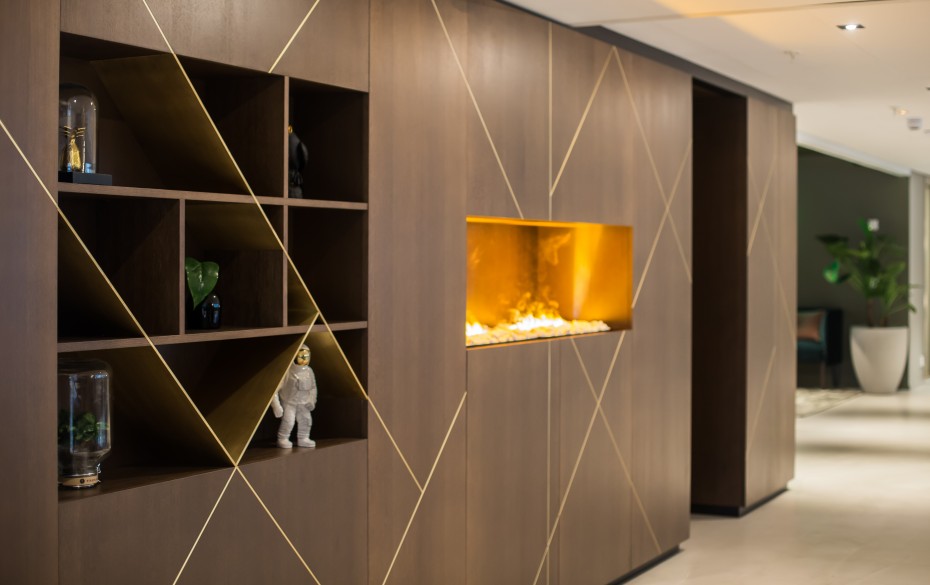
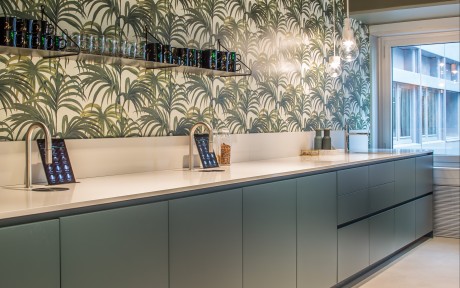
In the square, employees have celebrations, meetings or work during the day. There you can meet customers of Malling who are also welcome to use the space as a working zone or meeting place. The square is divided into different zones to create dynamics. There are sophisticated seating areas, reclined sofas and a huge long table in robust wood in addition to a coffee station and kitchen. Various types of ceiling, stained slats and ceiling panels helps to frame the zones and creates different atmospheres. We have chosen colors, textiles, wallpaper, different materials and furniture that you do not immediately associate with an office space. One example is the palm wallpaper in the kitchen and the use of velour, wool, brass, marble, smoked and stained wood. Together with the soft and rounded forms of furniture, it is created a beautiful balance between elegance and warmth, a homely atmosphere. The floor of the square is made of rough concrete ciré and creates a balance for a sumptuous expression.
Further into the office you will find the meeting center. Each of the meeting rooms is designed as a separate “living room”, with its own identity and distinctive character. In the choice of colors and materials, some of the rooms are more masculine, other feminine. Here you can choose rooms for purposes of meeting and your daily mood. Smoked oak floors in the meeting room are laid in classic herringbone pattern and differ from the concrete floor on the square. The contrast sharpen the senses and the homely feel is supported by the use of wavy fabrics and patterned wallpaper. The meeting rooms have different decorative pendants and different furniture that emphasize the distinctive rooms.
The work areas are simpler designed. Here the tools are toned down. To create dynamics between the work areas and divide the landscapes there are "portals" between them. The portal contains meeting rooms and multi rooms, and is framed by darker floors, walls and ceiling. This contrasts with the bright workplaces. The carpet is graded from dark to light and creates a soft transition between work areas and portals.